Structure guidelines

Improve accessibility with a clear presentation structure

Arranging PowerPoint presentations in a concise structure makes the documents more accessible for individuals with disabilities.

These guidelines and screenshots apply to Microsoft PowerPoint 2013 on Windows. There may be differences when applying the techniques with other versions of Microsoft PowerPoint.

Use slide layouts to strive for proper structure

Microsoft PowerPoint slides provide a default structure when the built-in slide layouts (e.g., Title Slide, Title and Content, Section Header, etc.) are selected.

These layouts provide correctly structured headings, lists, and a proper reading order. If the slide layout is modified the structure of the slide may not be presented accurately to users of assistive technology.

Avoid modifying these built-in slide layouts, unless necessary.

Steps

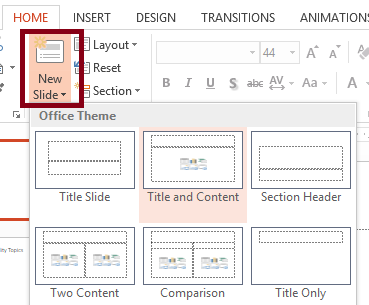
To select built-in slide layout, use the New Slide menu in the Home tab on the Ribbon.

Screenshot of the Microsoft PowerPoint 2013 Home tab with the New Slide option of the Slides group selected and highlight and menu open. The Title and Content option of the New Slides menu is selected.
Select a new slide layout using the New Slide button in the Home tab.

Give special attention to content within tables

For content within a table, use the simplest-possible table structure with appropriate headers to help as many users as possible understand and navigate the content contained in a table.

Unfortunately, PowerPoint currently does not support adding either table row or column headers in a way that assistive technologies can detect. Therefore, avoid using complex tables in PowerPoint.

If complex tables are necessary, the PowerPoint should be converted to a format that supports appropriate table row and column headers, such as a PDF.

Accessibility markup will need be added to each table in the PDF. There are many resources to help you create accessible PDF documents.